Tuesday, 27 March 2012

Fear in Adverts
This is the trailer for Bioshock, the technique used in this advertisement is fear because they put you in the eyes of the main protagonist as he fights a giant with a saw attached to his hands. This induces fears because it feels like you are fighting the giant so it has more of an impact. The reason they decided to use fear is because it is selling a video game and an audience would play a video game for the experience so the experience you would experience is fear in the game.
Chicago Pizza
The content is simple because it is selling a pizza. The form is parodic because it is taking the mic out of film trailers. It has a range of camera angles. For sound it has narration. it has lots of computer graphics because it is mimic of film trailers. it has some special effects from the explosions in the piece.
Lucozade advert
The content is complex because here is a lot to take in because its fast paced. The form is dramatic. there is a variety camera angles because it fast paced editing, there is also a lot of sound editing with the scream at the end its edited with an echo. it has some graphics at the end and also flashing text saying "Faster" I dont think there are much special effects.
Cadbury Advert
The content is complex because you don't know what they are selling in till the end. The form is surreal because that is quite strange way to move your eyebrows. the camera angles are mainly close-up so you can see the eyebrows moving closer. The sound is a very important part of the piece because the eyebrows moved to the beat to the music. they use computer graphics at the end when they show cadburys brand logo. There is one point were the eyes look like they have been edited by special effects.
Old Spice
The content is simple because he is selling Old Spice. The form is anti-realist narrative because props and the set are changing. they use camera angles very effectively because when the set changes it looks seamless, sound is just vocal. it does use computer graphics because at the end the there is text. There are special effect for the bit when the old spice bottle appears out of his hand.
Friday, 24 February 2012
Exporting
When I had finished the video I rendered on a quicktime conversion and it took about 15 minutes to finish then I uploaded the quicktime file to youtube on to Jocelin Francis' personal youtube account and since the 1/3/12 11:45 it has received 180 views on the website.


Tuesday, 21 February 2012
Revisions, decisions and results on editing
Decisions: I decided to edit the performance footage I had to see what i could come up with. I decided to shoot a shot of a girls eye to appear in the video when he mentions her brown eye but the girl I filmed had green eyes so I had to use colour correct to make them brown, this also made it pop out more and look more majestic.
Revisions: I decided that a performance on its own wasn't exciting for a music video so I decided to get a variety of shots instead of just three different angles of the performance. Also I got feedback from some people and they said I needed a woman presence to make the love song make more sense.
Results: I filmed some shots of Jocelin making a song on his computer to add some more shots to editing. I edited a brown eye overlapping a part of Jocelin's performance so this would create more female presence.
Revisions: I decided that a performance on its own wasn't exciting for a music video so I decided to get a variety of shots instead of just three different angles of the performance. Also I got feedback from some people and they said I needed a woman presence to make the love song make more sense.
Results: I filmed some shots of Jocelin making a song on his computer to add some more shots to editing. I edited a brown eye overlapping a part of Jocelin's performance so this would create more female presence.
Revisions, decisions and results on filming
Decisions: I had decided to film shots of Jocelin performing his song and I would also film clips of a couple having difficulties with their relationship which would link visually to the lyrics.
The stage was already being used for a school play so I got to use the staging which was a happy accident. The play was hairspray but they used a city background which I thought would imply that Jocelin is a simply city boy with a big heart for music.
Revisions: Half way through shooting I decided that the couple narrative wasn't necessary and it would make it harder to represent my artist if there was different people in the video, I did originally want the background to be plain so Jocelin would stand out but they had a play going on so their was different staging.
Results: I got all the shots and used them in the video, the result of the stage change is that the video looked more visually interesting rather than a plain background.
The stage was already being used for a school play so I got to use the staging which was a happy accident. The play was hairspray but they used a city background which I thought would imply that Jocelin is a simply city boy with a big heart for music.
Revisions: Half way through shooting I decided that the couple narrative wasn't necessary and it would make it harder to represent my artist if there was different people in the video, I did originally want the background to be plain so Jocelin would stand out but they had a play going on so their was different staging.
Results: I got all the shots and used them in the video, the result of the stage change is that the video looked more visually interesting rather than a plain background.
Friday, 10 February 2012
Tuesday, 7 February 2012
Me using my planning documents


This is me, editing the Lay Down music video using my storyboard to make sure which clip comes next and the paper edit to edit the music video with.

Here is me on set using the storyboard to see how I could make the shot match to what I had drawn on the storyboard.
This is where most of the music video takes place and it is exactly how I pictured it would be.


Here is a picture of me telling Jocelin how I imagined this shot to take.
This is the shot when in the music video it is Jocelin singing into a mic.
(The picture below is the final shot compared to the original storyboard pictures)
I tried to match the angle so it was exactly looking at him on the side but it is not as close up as in the original storyboard, the reason i did this is because I wanted to get a whole shot of him performing the whole song, if he was really close, he could of moved out of place, with more space in the shot he could do some hand gestures and you can see more of what he is doing to make the shot more visual.


Friday, 3 February 2012
Lay Down Rough Cut
Decisions- I have decided not to use some footage of the basic and simplistic love story and change it for something a bit different so what i have come up with is that the artist will be in a public area trying to hand out CDs but no-one wants to know but then one girl takes an interest and it seems like they fall in love.
Friday, 27 January 2012
Monday, 16 January 2012
Friday, 13 January 2012
Friday, 6 January 2012


Thursday, 5 January 2012

Tuesday, 20 December 2011
Friday, 16 December 2011
Props and costume
For the Artist he will be wearing jeans, a white tie and a purple tie (possibly a grey blazer). As for props he will have a microphone stand,microphone and a black guitar. The reason he is wearing this costume because it half and half between smart and casual this will imply that he works hard but can have down time too.
The couple will be dressed in whatever they are wearing as I want them to look real and not fake so they look like an authentic couple. the props will most probably be their phones as the story is based around a text message that ruins things.
The couple will be dressed in whatever they are wearing as I want them to look real and not fake so they look like an authentic couple. the props will most probably be their phones as the story is based around a text message that ruins things.
Casting Decisions
The artist will played by the actual performer and writer ( Jocelin Francis) of the song so copyright was not a problem for me as he gave me his permission.
Jocelin will be wearing a long sleeved shirt with no tie, grey trousers and canvas shoes when his performing on stage.
When he is recording the track he will be wearing a grey jumper, a t-shirt and a scarf on his tops, this will be the only costume in shot.

Jocelin will be wearing a long sleeved shirt with no tie, grey trousers and canvas shoes when his performing on stage.
When he is recording the track he will be wearing a grey jumper, a t-shirt and a scarf on his tops, this will be the only costume in shot.

Tuesday, 13 December 2011
The Treatment for Lay Down
Taylor's TreatmentThe reason I need all these things is because it will help me best show my client that i have planned every detail and I am professional in what I ask for such as the Sony HDV Z1E, a monitor, Final Cut Pro HD etc. I also need to stick to this budget as if I go over the budget I have promised my client will not be pleased as it shows I have planned it properly and this may jeopardize future projects with my client.
Friday, 9 December 2011

Friday, 2 December 2011
Monday, 14 November 2011
Music video
I decided to borden my making a music video knowledge by making a music video to some original copyright free music for my friend
Here is the finished video
Here is the finished video
Thursday, 3 November 2011
Music Videos
History of music video
The Beatles started doing promo clips for their music to put on television then Bob Dylan did a video for his song where he had cards with some of the lyrics on and then in 1981 MTV started their channel to play music videos 24/7 so there was a high demand for music videos so artists all around had to make a music video which would also help them become a visual star. An example of people who became famous mainly because of her music videos.
Now there are tons of music channels that play their own genres all day.
The Beatles started doing promo clips for their music to put on television then Bob Dylan did a video for his song where he had cards with some of the lyrics on and then in 1981 MTV started their channel to play music videos 24/7 so there was a high demand for music videos so artists all around had to make a music video which would also help them become a visual star. An example of people who became famous mainly because of her music videos.
Now there are tons of music channels that play their own genres all day.
Tuesday, 18 October 2011
What we learnt last lesson
We learnt about keyframing in our last lesson this can be used to move text or images around and we also learnt how to create a logo with a transparent background on Photoshop then transfer it too final cut pro and use it. We did this by taking the background out of the mtv logo and making it the background transparent and then saving it as a TIFF file and saving the transparency. Key-framing i do different to what Sir showed. I go into motion and change either scale, rotation or center point i press the key-frame button and then move it alogn the timeline, then change the scale, rotation or center point again then click the keyframe button again and this will make it move
Thursday, 6 October 2011
Tuesday, 27 September 2011
Friday- Rebecca Black
This is the original music video to Friday by Rebecca Black which we did our own versions of
Friday, 23 September 2011
Friday, 16 September 2011
10 questions to final cut express
1. Is there chroma keyer in final cut express?
2. How can i have 3 shots in one scene?
3. How do i mark on the timeline?
4. How many tracks can i have at once?
5. I there a shortcut to spilt a shot?
6. is there a sepia effect?
7. can i crop my footage?
8. Can i rotoscope?
9. What quality can i render in?
10. Is there a blur effect?
2. How can i have 3 shots in one scene?
3. How do i mark on the timeline?
4. How many tracks can i have at once?
5. I there a shortcut to spilt a shot?
6. is there a sepia effect?
7. can i crop my footage?
8. Can i rotoscope?
9. What quality can i render in?
10. Is there a blur effect?
Tuesday, 19 July 2011
My feedback on my logos
I give out my logos to my classmates and this is the feedback i got from each


Friday, 1 July 2011


 The reason I have choosen Jpeg to upload these final versions of the logo i have created is because on the internet jpeg is the best quality that can be sent around easily and still maintains some good quality other than some other formats. For a billboard i would use a vector file because you can stretch it and it wont pixelate at all so it is perfect for billboards. I would use jpeg for a letter head too because all the tests i print were on jpeg and they had extremely good quality.
Tuesday, 28 June 2011
Revision and decisions
Revisions: From my sketches I have seen that i have changed or added a few more things to my designs, the main thing i have changed is that on the sketches i made all the logos the same colour but the final finished logo all had their own colour. Lock was red, Mixx was purple and Buzz is green.
Also i changed the font of them as in the sketches they were all the same font and looked exactly the same but then i changed them so they all were their own thing but with the same turntables
Decisions: I'm pleased with how the turntables turned out as they look good as before i was worried if i would be able to attach letters on top of them but it worked out nicely. I am also pleased with the fonts and colours i chose to give them as now they are their own thing but still belong to the family.
Tuesday, 21 June 2011




Tuesday, 14 June 2011
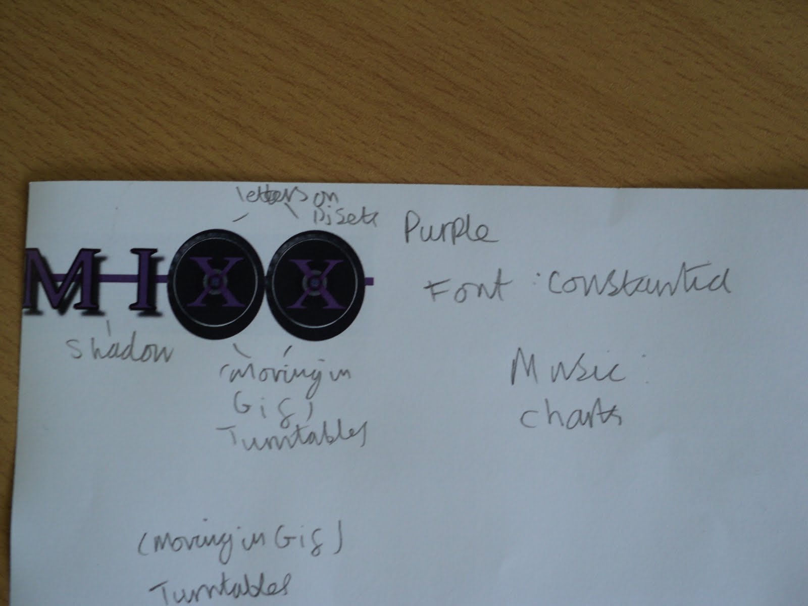
Mixx logo
5. I draw a line through the middle of the letters to link them together
4. I added the drop shadow effect to give it that coming at ou effect


 3. Then i manually draw black-lines around the letters that weren't on the turntables just to make them more interesting

4. I added the drop shadow effect to give it that coming at ou effect


 3. Then i manually draw black-lines around the letters that weren't on the turntables just to make them more interesting
2. The I added a new layer with the two turntables and put them behind the two XXs and erased out the middle of the X so it seems to be print on the turntable.
1. I started with the constania font and wrote in MIXX in capital letters
Lock progress
5. Then i added a line through all the letters to link them together
4. I then added a drop shadow just to add a coming out at you effect


 3. Then I added a black outline for the L & C

4. I then added a drop shadow just to add a coming out at you effect


 3. Then I added a black outline for the L & C
2. Then I added the turntables to OC
1. I started with this font called fairydustb
Subscribe to:
Posts (Atom)