Showing posts with label Unit 54 C3. Show all posts

Tuesday, 17 April 2012

Different file formats using LOCK logo


This file is PNG is a great file to use on recent web browsers
which would be perfect for the header of the website
and also it has a high quality loss compression system


This file is BMP supports a wide range of colours
this would be perfect for a billboard
and it also works for all types of window programs.


This image is saved with GIF, it works well with
the internet very well and also you can
use this moving animations.
This may be used on the website
for the contexts page

Different file formats using MIXX logo


This file is a JPEG, a good use for this format is that it is very versatile
and is a good quality image,
this could be used for t-shirts


This file is a TIFF file a good use for this is that when making an image
if you want to save the transparency, you can do this by using TIFF,
this would be good for the letter head


This image is a Vector file which is good because instead of using pixels
it uses shapes to make the image more sharp and clear. This would be good for billboards

Tuesday, 14 June 2011

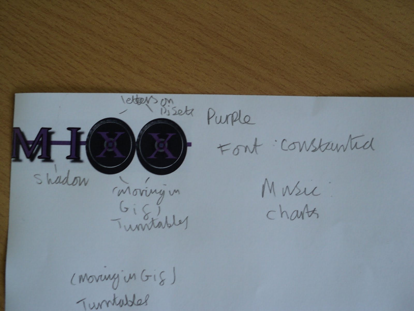
Mixx logo

5. I draw a line through the middle of the letters to link them together
4. I added the drop shadow effect to give it that coming at ou effect


3. Then i manually draw black-lines around the letters that weren't on the turntables just to make them more interesting


2. The I added a new layer with the two turntables and put them behind the two XXs and erased out the middle of the X so it seems to be print on the turntable.


1. I started with the constania font and wrote in MIXX in capital letters

Lock progress

5. Then i added a line through all the letters to link them together

4. I then added a drop shadow just to add a coming out at you effect


3. Then I added a black outline for the L & C


2. Then I added the turntables to OC


1. I started with this font called fairydustb

Buzz progress

5. I added a line going behind the text to join them all together.
4. In this installment I added drop shadow on to the B & U.


3.In this one i turned down the opacity on the ZZ


2. then I added the turntables and made the ZZ thinner


1. I started with this font called constania

My logo idea