Labels
- Unit 1 C1 (1)
- Unit 1 C2 (10)
- Unit 1 C3 (4)
- Unit 2 C1 (4)
- Unit 2 C2 (1)
- Unit 2 C3 (2)
- Unit 2 C4 (4)
- Unit 29 C1 (2)
- Unit 29 C2 (1)
- Unit 29 C3 (14)
- Unit 29 C4 (9)
- Unit 29 C5 (3)
- Unit 3 C1 (1)
- Unit 3 C2 (4)
- Unit 3 C3 (3)
- Unit 3 C4 (1)
- Unit 30 C1 (1)
- Unit 30 C2 (6)
- Unit 30 C3 (15)
- Unit 30 C4 (1)
- Unit 32 C1 (1)
- Unit 32 C2 (1)
- Unit 32 C3 (22)
- Unit 32 C4 (5)
- Unit 54 C1 (2)
- Unit 54 C2 (7)
- Unit 54 C3 (8)
- Unit 54 C4 (5)
Tuesday, 19 July 2011
Friday, 1 July 2011


The reason I have choosen Jpeg to upload these final versions of the logo i have created is because on the internet jpeg is the best quality that can be sent around easily and still maintains some good quality other than some other formats. For a billboard i would use a vector file because you can stretch it and it wont pixelate at all so it is perfect for billboards. I would use jpeg for a letter head too because all the tests i print were on jpeg and they had extremely good quality.
Tuesday, 28 June 2011
Revision and decisions
Revisions: From my sketches I have seen that i have changed or added a few more things to my designs, the main thing i have changed is that on the sketches i made all the logos the same colour but the final finished logo all had their own colour. Lock was red, Mixx was purple and Buzz is green.
Also i changed the font of them as in the sketches they were all the same font and looked exactly the same but then i changed them so they all were their own thing but with the same turntables
Decisions: I'm pleased with how the turntables turned out as they look good as before i was worried if i would be able to attach letters on top of them but it worked out nicely. I am also pleased with the fonts and colours i chose to give them as now they are their own thing but still belong to the family.
Tuesday, 21 June 2011
Tuesday, 14 June 2011
Mixx logo
5. I draw a line through the middle of the letters to link them together
4. I added the drop shadow effect to give it that coming at ou effect


3. Then i manually draw black-lines around the letters that weren't on the turntables just to make them more interesting

4. I added the drop shadow effect to give it that coming at ou effect


3. Then i manually draw black-lines around the letters that weren't on the turntables just to make them more interesting2. The I added a new layer with the two turntables and put them behind the two XXs and erased out the middle of the X so it seems to be print on the turntable.
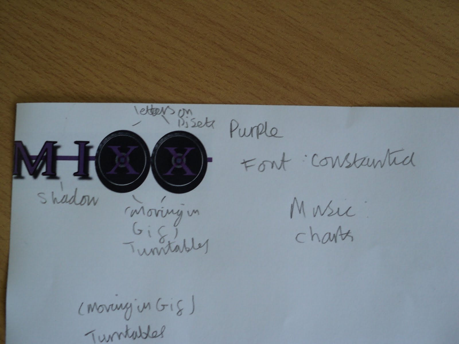
1. I started with the constania font and wrote in MIXX in capital letters
Lock progress
5. Then i added a line through all the letters to link them together
4. I then added a drop shadow just to add a coming out at you effect


3. Then I added a black outline for the L & C

4. I then added a drop shadow just to add a coming out at you effect


3. Then I added a black outline for the L & C2. Then I added the turntables to OC
1. I started with this font called fairydustb
Buzz progress
5. I added a line going behind the text to join them all together.
4. In this installment I added drop shadow on to the B & U.

3.In this one i turned down the opacity on the ZZ2. then I added the turntables and made the ZZ thinner
1. I started with this font called constania
Tuesday, 24 May 2011
Help-sheet
Helpshheeett
View more presentations from hiletman
Tuesday, 17 May 2011
Tuesday, 29 March 2011
Exporting
After I finished editing the video on Final Cut Express I opened up file and selected using quicktime conversion which puts the video onto a quicktime file, after I exported it I knew that YouTube was compatible with Quicktime so I uploaded it on the 12lcm YouTube page and titled "Taylor's Ident"The reason i chose to put it on YouTube is because it is a well known website and it will probably get more views on there.
Friday, 18 March 2011
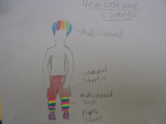
New costume change
The reason I have changed the costume is because the availability of the original costume has become impossible so I have changed to something more simple and better appealing to our target audience which are fun loving party people.
Tuesday, 15 March 2011
Location for Train Journey

This location is perfect because it is close to me, there are no barriers and we can easily film on the train because it is a quiet station.
Uploading and editing
Decisions: I have uploaded the establishing shots of sutton common train station and edited them in with some music i made, with a old black & white effect. This will be perfect to establish the set before we are introduce the story and characters.
Revisions: I have not used any of these previous shots in the finished project because i couldn't fit them in with the other shots because the new shots needed to all be put in as they were crucial to the narrative and the advert had to be a maximum of 30 seconds.
Decisions: I have been editing together the shots from Craig and George's performance on the train and have edited together without the establishing shots but I do have a shot that establishes the setting at the beginning when Craig gets on the train
Filming Sessions
Decisions: I decided to only film on the train itself even though I had planned to have a few more shots of Craig on the platform but I wouldn't have enough time to fit it all in 30 seconds which is how long the ident has to be and the train scene is more important.
Revisions: I realized that I had to establish the set so I decided to have a quick shot of Craig when the train arrives.
Results: Because I had so many shots to include I had to make the editing fast past which really worked out well to the music.
Revisions: I realized that I had to establish the set so I decided to have a quick shot of Craig when the train arrives.
Results: Because I had so many shots to include I had to make the editing fast past which really worked out well to the music.
Problems
I have had quite a big problem with my group as the other person in my group has left the course so I am now working independently by myself
Friday, 11 March 2011
Tuesday, 1 March 2011
Tuesday, 15 February 2011
Our Target Audience
This is a picture of our target audience who look like party goers
We are targeting to Male and Females between 19-30 and we decided that most of these people around these age probably have a job so when they get home they will probably want to get out of the work mind set so they will want to do something kooky and silly so that is why we show strange but funny things for the to un-whined so our ident will also respond to this as there is a guy in suit (coming back from work) seeing someone who is strange and then he joins in being strange by playing music from his briefcase.
Live type Title
We used a program called livetype were i designed our title for the Grid, the colours I used were pink and black because I like those combination of colours and they appeal to a wide variety of people, as girls like pink and boys like black. The font I used for it is called Rip tape and i got it from www,Dafont.com we had done some research before were we recreated a simialr effect with masking tape to see how it looked and we both agreed it was good, the reason I chose this is because the effect gives a kinda of urban culture feel. The effect I used to make an entrance with the words is called Text Static in this they glide in and also jump out towards the front give it an uneasy feel. Then the next effect is called random snap were it all goes into place an a random order on top of this effect is a red flash to give some more urban culture because it seems like a police siren and then to finish it off we give a simple fade away. all this with a a black background.
Friday, 4 February 2011
Casting decision for ident 1, ident 2 and ident 3
(left) Craig Hawker
(right) George Haywood
The reason I have chosen these two is because George looks and acts like a party animal which fits his character well because the character has just come back from a party, Craig is good for the part because he wears glasses which will make him seem smart which will work well with his character who is a business man who is on his way home from work.
I have also chosen these people because they both do the course and easy to get to for filming which makes them more accessible at the right times.
Subscribe to:
Posts (Atom)