Tuesday, 28 June 2011

Revision and decisions

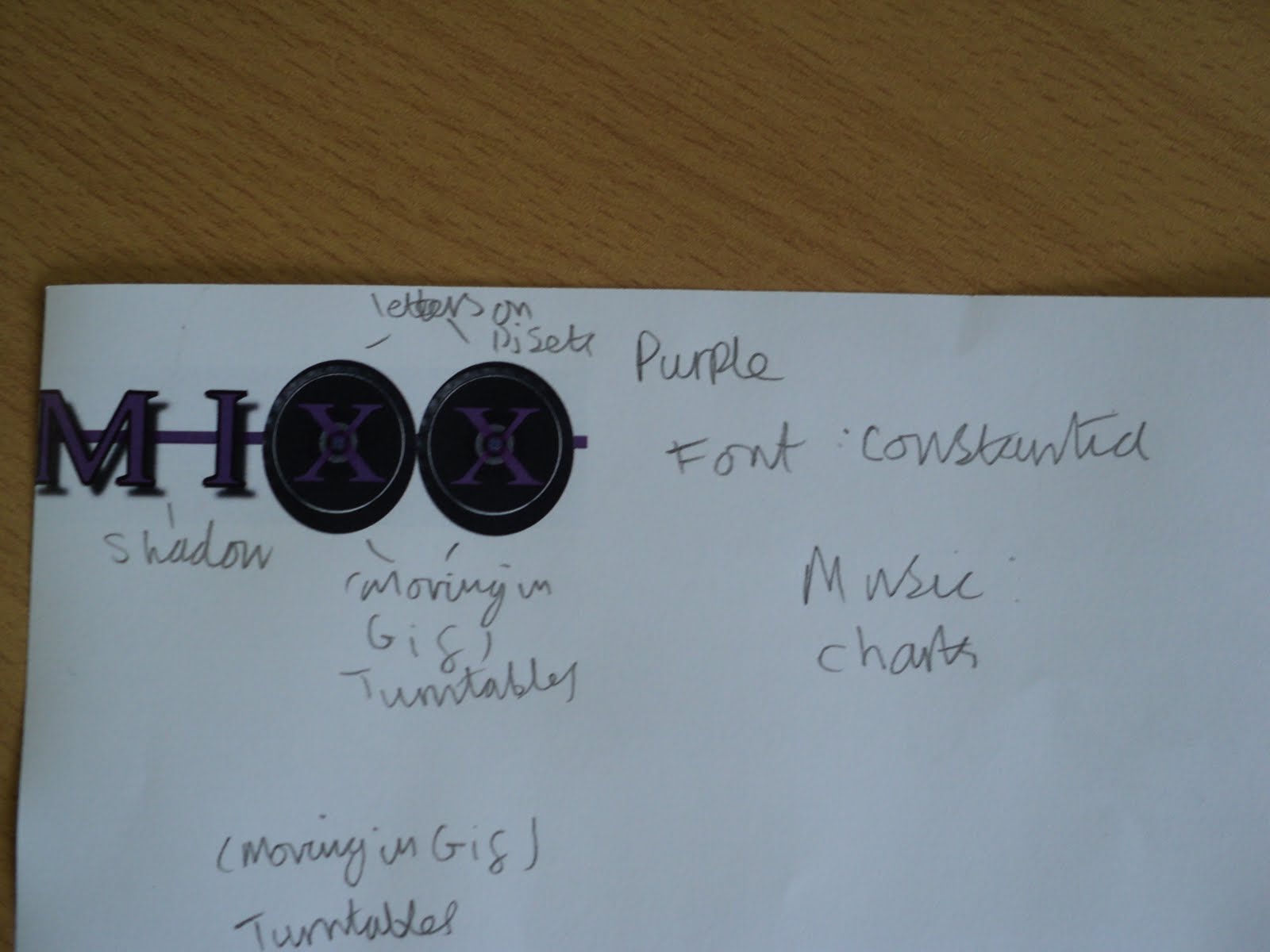
Revisions: From my sketches I have seen that i have changed or added a few more things to my designs, the main thing i have changed is that on the sketches i made all the logos the same colour but the final finished logo all had their own colour. Lock was red, Mixx was purple and Buzz is green.
Also i changed the font of them as in the sketches they were all the same font and looked exactly the same but then i changed them so they all were their own thing but with the same turntables

Decisions: I'm pleased with how the turntables turned out as they look good as before i was worried if i would be able to attach letters on top of them but it worked out nicely. I am also pleased with the fonts and colours i chose to give them as now they are their own thing but still belong to the family.

Tuesday, 14 June 2011

Mixx logo

5. I draw a line through the middle of the letters to link them together
4. I added the drop shadow effect to give it that coming at ou effect


3. Then i manually draw black-lines around the letters that weren't on the turntables just to make them more interesting


2. The I added a new layer with the two turntables and put them behind the two XXs and erased out the middle of the X so it seems to be print on the turntable.


1. I started with the constania font and wrote in MIXX in capital letters

Lock progress

5. Then i added a line through all the letters to link them together

4. I then added a drop shadow just to add a coming out at you effect


3. Then I added a black outline for the L & C


2. Then I added the turntables to OC


1. I started with this font called fairydustb

Buzz progress

5. I added a line going behind the text to join them all together.
4. In this installment I added drop shadow on to the B & U.


3.In this one i turned down the opacity on the ZZ


2. then I added the turntables and made the ZZ thinner


1. I started with this font called constania

My logo idea